History of the logo
Since 1914 the emblem of the Italian National Olympic Committee has changed several times: each version tells a piece of the history of Italy and its sport.
The beginnings
CONI, the Italian National Olympic Committee, was founded in 1914 as part of the international Olympic movement. Its task is to organise and promote Italian sport through the national federations.
The first logo
The first emblem was designed in the early 1920s, under Fascism, when sport was seen as a tool for physical and moral education. It brought together the five Olympic rings, the fasces, the Italian tricolour flag and the dotted acronym C.O.N.I., topped by the crown of the Kingdom. In those years the State recognised CONI as a public-law body with legal personality.
1947: the logo of the Republic
In republican Italy the royal crown and the fasces disappear from the emblem. With State funding gone, CONI finances itself through sports pools, Totocalcio and Totip, run through Sisal.
1960: the Rome Olympics
For the Rome Games the logo is simplified and stripped of references to the past: what remains is the dotted acronym, the Olympic rings and a star. There were no strict rules of use, though: the acronym appeared sometimes in sans-serif type, sometimes with serifs, sometimes without the rings.
1968: Mimmo Castellano's ribbon
When the Youth Games (Giochi della Gioventù) were launched, CONI asked the graphic designer Mimmo Castellano for a new logo. The result was a spare, rigorous logotype: the first three letters are drawn from a single ribbon. At very small sizes the thin white lines were lost, so in 1984 the design was lightened with light-blue lines.
2004: the I-team
For the Olympic cycle from Athens 2004 to Turin 2006 the agency Inarea created the identity of the Italian Olympic team, the I-team, which later became CONI's identity too. It is a shield made of lines as thick as the letters of the word "Italia": the first three green, the rest red. The CONI name is set in capital Frutiger.
2014: the tricolour shield
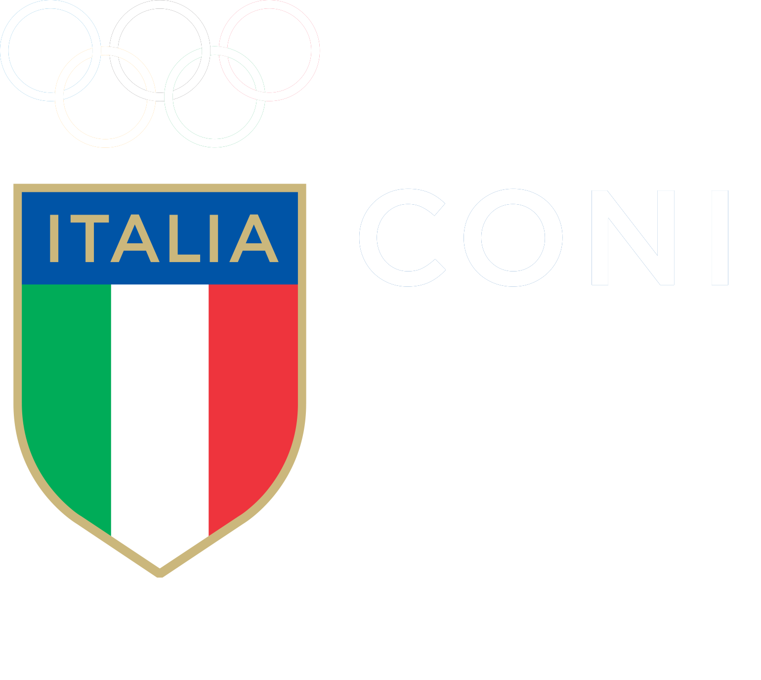
A hundred years after its founding, CONI renewed its identity once more, again with Inarea. The logo brings back the tricolour shield everyone remembers sewn onto the shirts of Italy's athletes: a gold border, the word Italia beneath the five Olympic rings, the CONI name in capitals in the Gotham typeface. It is the emblem that represents Italian sport today, in Switzerland too.
Source: texts adapted from the CONI entry of the Museo del Marchio Italiano.